Views
A view is a tab inside a dashboard. For example, the screenshot below shows a separate view for lights on the Overview dashboard.
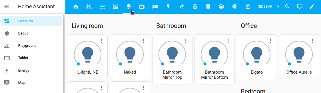 A lights view tab on the Overview dashboard
Views control the layout.
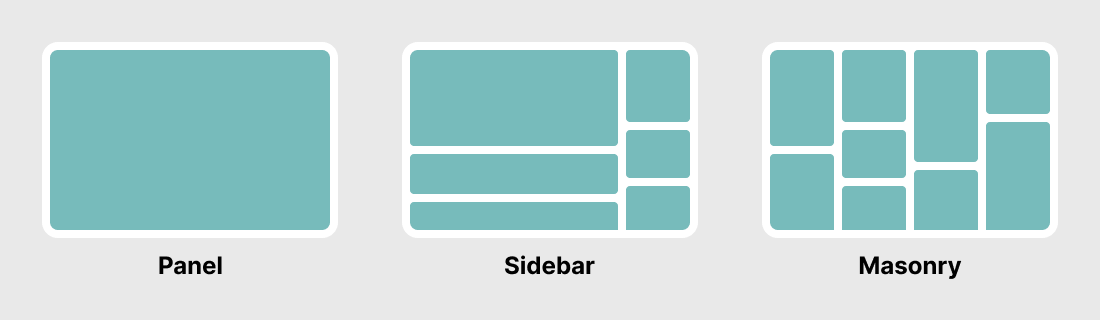 The three basic view layouts: panel, sidebar, and masonry
There are four different view types:
- Sections (default): Arranges cards in a grid system and lets you group them in sections.
- Masonry: Arranges cards in columns based on their card size.
- Panel: Displays one card in full width. For example a map or an image.
- Sidebar: Arranges cards in 2 columns, a wide one and a smaller one on the right.
Adding a view to a dashboard
-
To add a view to your dashboard, in the top right corner, select the pencil icon.
-
Select the
+button in the top menu bar.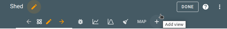
-
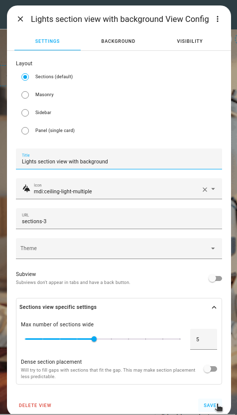
Define the view settings:
- If you want a view title, enter the Title.
- If you want to see an icon, select the view icon.
- If an icon is defined, only the icon is shown. The text only shows as a tooltip.
- We use Material icons
.
- If you want to link to another view, define the URL.
- If you want to use a previously defined theme, select the theme.
- Select the view type.
- If this view is meant to be used as a subview only, enable the Subview toggle.
- If you are using Sections view, choose the number of columns you want to use, and, if you want to let the system fill gaps between cards, enable Dense section placement..
-
To use a background image, on the Background tab, select an image.
- Upload picture lets you pick an image from the system used to show your Home Assistant UI.
-
Local path lets you pick an image stored on Home Assistant. For example:
/homeassistant/images/lights_view_background_image.jpg.- To store an image on Home Assistant, you need to configure access to files, for example via Samba or the Studio Code Server add-on.
-
web URL let you pick an image from the web. For example
https://www.home-assistant.io/images/frontpage/assist_wake_word.png.
-
On the Badges tab, select the entities you want to be represented by a badge.
- Sidebar and panel views do not support badges.
-
By default, the new section is visible to all users. On the Visibility tab, you can disable the view for users.
Migrating a view into a sections view
If you have already defined a view but you would now like to have it in a section view type, you can migrate that content. For example, you can migrate from a masonry to a sections view. Currently, you cannot migrate a sections view type into another view type.
Migrating does not affect the current view. It will stay as is, and a new, additional view is created.
To migrate a view into a sections view type, follow these steps:
-
Open the view you want to migrate, and go into edit mode.
-
In the configuration dialog, select the new view type.
-
If the new view type offers additional settings, define those settings.
- For more information on those settings, refer to the documentation of that view type.
-
In the top-right corner, select Convert.
- Result: A new, additional view is created.
- Your current view will stay untouched.
- A new tab opens, and all your cards are imported to the new view.
-
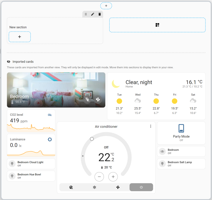
In the Imported cards section, pick each of the cards, and drag them into the sections.
- To edit and customize the view, follow the steps in the sections view documentation.
-
To save your changes, select Done.
- Result: Your new dashboard is shown.
- If you have cards that were not yet integrated, you can still add them later. They are still available in the Edit mode, in the Imported cards section.
URL of a view
You can link to one view from a card in another view when using cards that support navigation (navigation_path). The string supplied here will be appended to the string /lovelace/ to create the path to the view. Do not use special characters in paths. Do not begin a path with a number. This will cause the parser to read your path as a view index.
Example
View configuration:
- title: Living room
  # the final path is /lovelace/living_room
  path: living_room
Picture card configuration:
- type: picture
  image: /local/living_room.png
  tap_action:
    action: navigate
    navigation_path: /lovelace/living_room
View icon
If you define a view icon, the icon instead of the title will be displayed, the title will then be used as a tool-tip.
Example
- title: Garden
  icon: mdi:flower
Visible
You can specify the visibility of views as a whole or per-user. (Note: This is only for the display of the tabs. The URL path is still accessible)
Example
views:
  - title: Ian
    visible:
      - user: 581fca7fdc014b8b894519cc531f9a04
    cards:
      ...
  - title: Chelsea
    visible:
      - user: 6e690cc4e40242d2ab14cf38f1882ee6
    cards:
      ...
  - title: Admin
    visible: db34e025e5c84b70968f6530823b117f
    cards:
      ...
Options for visible objects
If you define visible as objects instead of a boolean to specify conditions for displaying the view tab:
Changing the view type in YAML
You can change the layout of a view in YAML by using a different view type. The default is section.
Example
- title: Map
  type: panel
  cards:
    - type: map
      entities:
        - device_tracker.demo_paulus
        - zone.home
Theme
Set a separate theme for the view and its cards.
Example
- title: Home
  theme: happy
Background
You can style the background of your views with a theme. You can use the CSS variable lovelace-background. For wallpapers you probably want to use the example below, more options can be found here
Example
# Example configuration.yaml entry
frontend:
  themes:
    example:
      lovelace-background: center / cover no-repeat url("/local/background.png") fixed
Subview
A “View” can be marked as “Subview”. Subviews won’t show up in the navigation bar on top of the sidebar. Subviews can, for instance, be used to show detailed information; you could link to this subview from a page with a clean look with only basic information (by using cards that support the navigate action). Think of a view with a few thermostats and a subview with status information on the heating/cooling device.
When on the subview, the navigation bar only shows the name of the subview and a back button (no icon is shown).
By default, clicking on back button will navigate to the previous view but a custom back path (back_path) can be set.
You can access subviews from other parts of your dashboard by using cards that support the navigate action.
Example
Simple subview:
- title: Map
  subview: true
Subview with custom back path:
- title: Map
  subview: true
  back_path: /lovelace/home
Configuration Variables
A list of view configurations.
List of entities IDs or badge objects to display as badges. Note that badges do not show when view is in panel mode.
Icon-name from Material Design Icons. You can use any icon from Material Design Iconsmdi:, ie mdi:home. Only for “View”, not for “Subview”.
Hide/show the view tab from all users or a list of individual visible objects.
Example
View configuration:
- title: Living room
  badges:
    - device_tracker.demo_paulus
    - entity: light.ceiling_lights
      name: Ceiling Lights
      icon: mdi:bulb
    - entity: switch.decorative_lights
      image: /local/lights.png
Subview configuration:
- title: "Energieprijzen"
  path: "energieprijzen"
  subview: true
  back_path: "/ui-data/climate"

  cards:
    - type: entities
      entities:
        - sensor.today_avg_price